How To Make Typography Posters
Today, I'm going to show you how to create an inspirational typographic poster using some of Illustrator's basic tools and handy keyboard shortcuts. Truth be told, I love inspirational and witty quotes, especially on design and creativity.
I am sure most of you out there have at least one favorite citation, so I thought it would be nice to create a typographic design based on one such popular, catchy phrase.
Let's get started!
1. Setting up the document
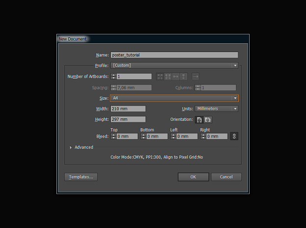
Open Adobe Illustrator and create a new document (Ctrl+N) with the dimensions of 210 x 297mm.
With the Rectangle Tool (M), draw a rectangular of the document size and fill it with:
R: 108
G: 179
B: 185
(#6cb3bb)
If the layer has a stroke, remove it.
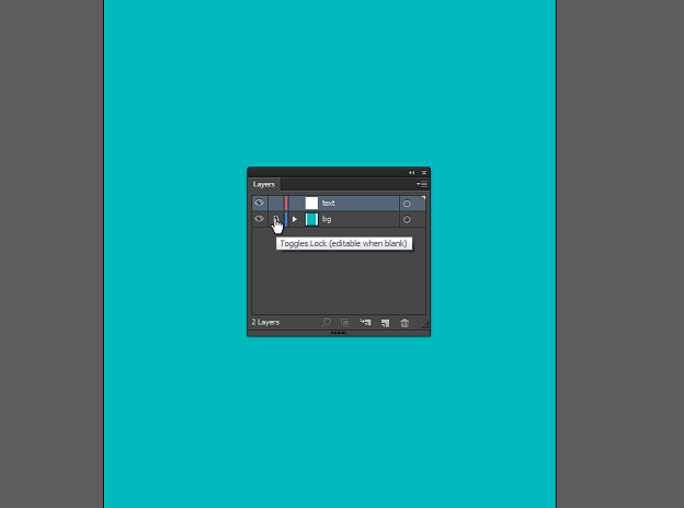
Go to the Layers tab (Window › Layers or click F7), rename the current layer to "bg" (short for background), and lock it (Toggles Lock). Next, create a new layer called "text".
2. Adding the text
I'm going to use the famous quote by Rebecca Reubens, "Design is to invent with intent". Feel free to choose another phrase that is close to your heart. It should be a short quote in order to keep the poster design crisp and balanced.
Select the Type Tool (T), then pick a white fill color and remove the stroke.
I use the following fonts:
- FabfeltScript Bold Regular (150 pt) for the word "Design"
- Roboto Slab Bold (42 pt) for the words "IS TO"
- Big John for the words "INVENT" (72 pt) and "INTENT" (70 pt)
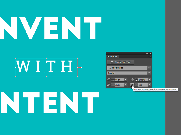
- Roboto Slab Regular (30 pt) for the word "WITH". Also, put Tracking=300 in the Character tab (Window › Type › Character or click Ctrl+T)
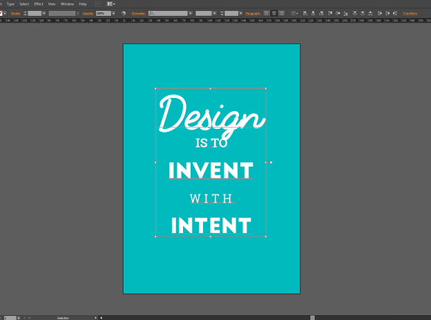
Once all that is entered, you have the following mockup:
3. Creating a fancy arrow
It's now time to work on the details. Let's add an arrow behind "IS TO".
Go to the Layers tab and lock the current layer. Create a new layer called "elements" and move it under the text layer.
Set the fill color:
R:244
G:206
B:47
(#f4ce2f)
Pick the Rectangle Tool (M) and right-click on the layout. In the pop-up window, set the dimensions to 110 х 16mm.
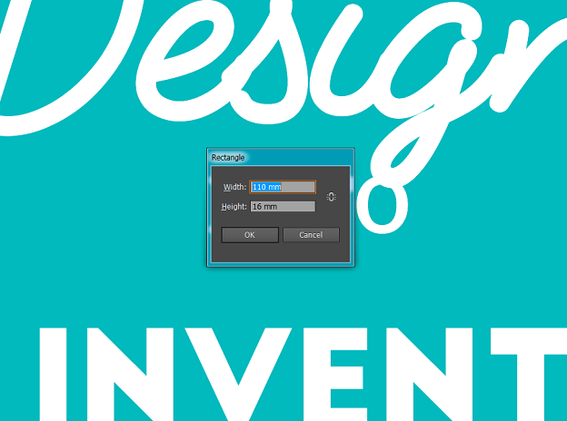
Use the Rectangle Tool (M) once again. Let the fill color remain R:244 G:206 B:47 (#f4ce2f) and create a 124х10 mm rectangular.
Put a ruler guide in the layout center to align all the elements. To make sure that the guides are active, click View › Guides > Show Guides. Set the guide vertically at 105 mm and align the boxes according to this guide line.
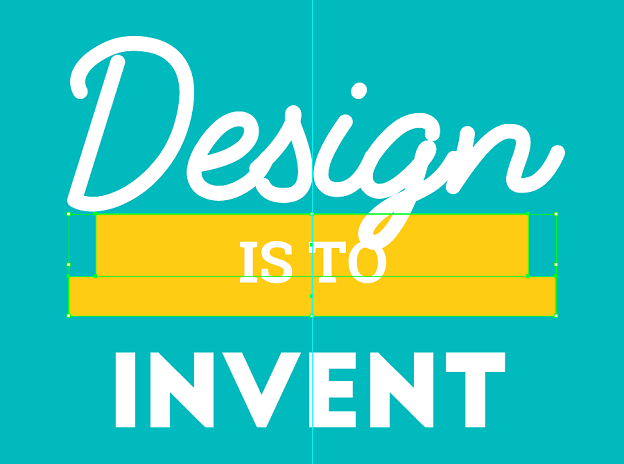
Now select the lower rectangular and use the Pen Tool (P) to add a point in the middle of the lower part of the box. With the same tool, remove the bottom corners to get an upside-down triangle.
Select it with the box above and in the Pathfinder tab (Window › Pathfinder or Shift+Ctrl+F9) pick Shape Modes: Unite.
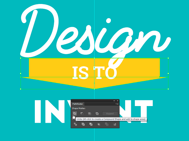
Right-click on the arrow, go to Transform › Move (or Shift+Ctrl+M) and set the following values: Position Horizontal – 2 mm and Position Vertical – 2 mm. Click Copy. Now you have a new element slightly shifted to the right and down.
Fill the duplicate arrow with color:
R:199
G:86
B:65
(#c75641)
Right-click on it and go to Arrange › Send to Back (or Ctrl+Shift+[) to move it to the background.
You will need to modify the lower arrow to add some volume to the element. You will need the Pen Tool (P) to add necessary points and the Direct Selection Tool (A) to move them.
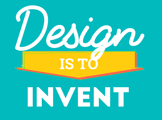
It's time to create the inner shadows.
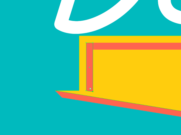
With the Rectangle Tool (M), create a 106 х 2mm rectangular. Align it in the center of the top border of the upper arrow. Hit Shift+Ctrl+M and shift it vertically by 2mm: Position Vertical – 2mm. This time click ОК, because you need to move this element without creating a copy.
Now create a 2 х 14mm rectangular and align it to the top left corner of the previously created rectangular. With the Direct Selection Tool (A), select the lower right corner of the newly created box and drag it a little bit down until the lower part of this rectangular is parallel to the lower shadow of the arrow.
4. Adding a shadow text effect
In the Layers tab, lock the current layer, go to the text layer and activate it. Select the layer with "IS TO" and go to Object › Expand.

Call the Move window, Transform › Move (or Shift+Ctrl+M), and set the same parameters as for the arrow shadow: 2 mm horizontally and 2 mm vertically and then click Copy.
Fill the shadow layer with:
R:91
G:42
B:24
(#5b2a17)
Hit Ctrl+Shift+[ and move it to the background.
Apply the following color to the main text:
R:44
G:139
B:139
(#2c8b8b)
Here's what you get:
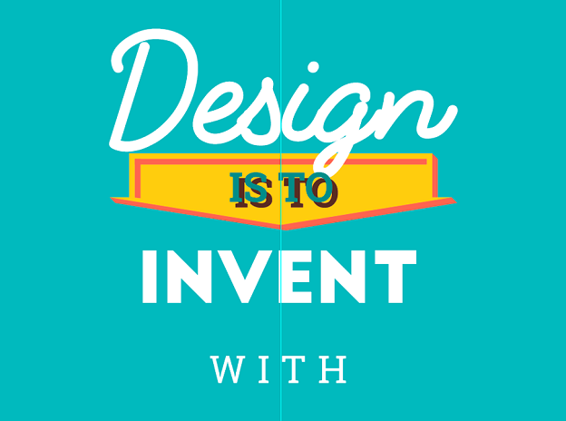
Now let's edit this text shadow. Just like for the arrow shadow, use the Pen Tool (P) and Direct Selection Tool (A) to get the following effect.
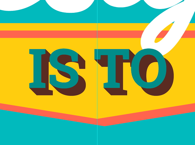
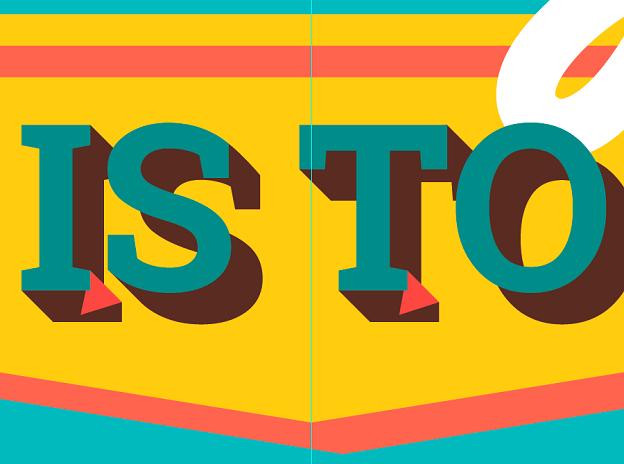
As you can see, the shadows of the "I" and "T" don't look right. You can easily fix this by adding one element to each letter. Remove the selection from all layers, take the Pen Tool (P) and add two triangles to make the shadow look real. Then hit Ctrl+Shift+] to move the green text over all layers.
On the screenshot below I made the new elements red so you can see the shape I created. Of course, they should be the same color as the text shadow so they are not visible.
5. Adding curved text
Let's proceed to the word "Design". Delete it. That's right. 🙂 Take the Pen Tool (P), remove the fill color and make the color of the stroke white.
Draw a curve like on the screenshot below:
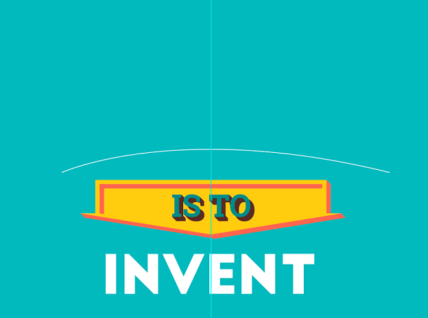
Using the Type Tool (T), left-click on the newly created arc. You will see the text cursor on the curved line. Type the word "Design" using the FabfeltScript Bold Regular font at 150 pt size.
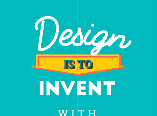
Select this text and go to Object › Expand menu. Click ОК. Slightly center the text and move the left corner a little lower. Now it looks like this:
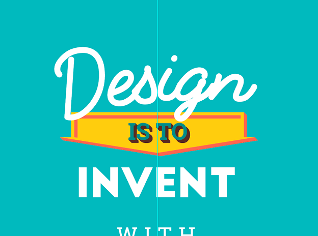
Now let's add a shadow. The text style is different, so it would be nice to have a special shadow too. Select the word "Design" and in the Pathfinder tab (Shift+Ctrl+F9) select Shape Modes: Unite.
Once again, open the Move pop-up (Shift+Ctrl+M) and set Position Horizontal – 2 mm and Position Vertical – 2 mm. Click Copy.
Fill the new layer with the following color:
R:199
G:86
B:65
(#c75641)
Hit Shift+Ctrl+M and set Position Horizontal – 1mm and Position Vertical – 1mm.
Click Copy again. Fill this layer with:
R:33
G:77
B:90
(#214d5a)
Here's what you have now:
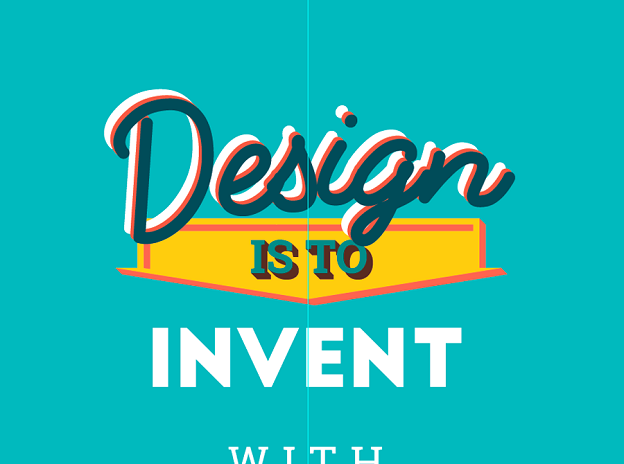
To make it easier to work with the shadow, cut (Ctrl+V) the white "Design" layer. Create a new layer in the Layers window and paste the word "Design" there (Ctrl+F). Lock this layer and turn its visibility off. Then go back to the text layer. Select the dark "Design" layer and hit Ctrl+Shift+[ to move it to the very bottom.
You need to apply one of the overlay modes in the Pathfinder tab. Because of the font peculiarities you can see that the letter "D" is not connected to other letters. The same is true with the dot in the letter "i". If you try to apply the effect now, you won't get the necessary result. You'll need to do it step by step.
First, select both "Design" words and ungroup them hitting Ctrl+Shift+G. Now you can see that each element can be edited separately.
Let's start with the "D". Select both layers and in the Pathfinder tab (Shift+Ctrl+F9) select Shape Modes: Minus Front.
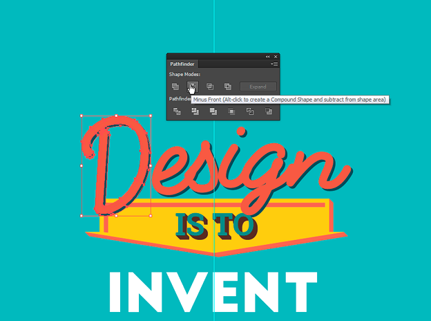
Do the same with the rest of the word. Then go back to the Layers tab, turn on the visibility, unlock the layer, and cut the white word "Design". Press Ctrl+F to paste it to the text layer. Now select all the elements of the word "Design" and group them by clicking Ctrl+G.
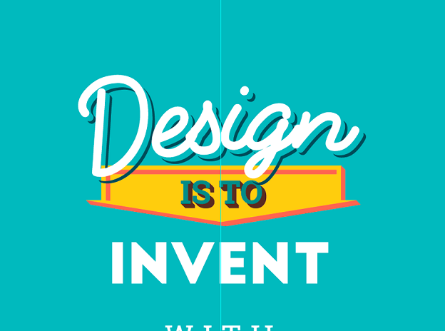
The fancy shadow is ready:
6. Creating a ribbon
First, lock the current text layer in the Layers panel and unlock the "elements" layer. Apply the fill color:
R:79
G:142
B:137
(#4f8e89)
Hover the mouse over the Rectangle Tool in the Tools panel and select the Rounded Rectangle Tool from the list.

Left-click on the poster layout and set the parameters of 124х28 mm with a corner radius of 100 mm.
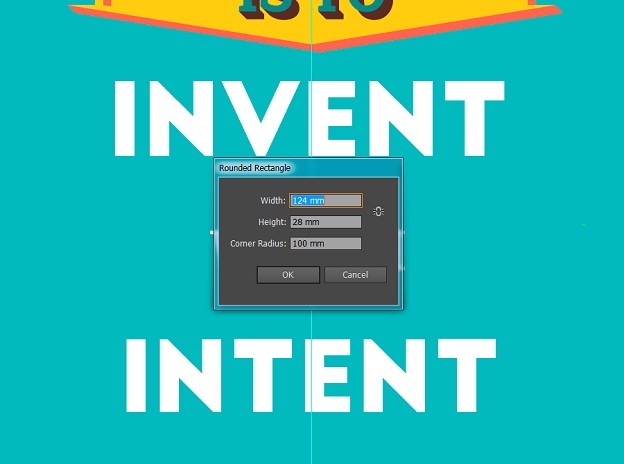
Using the Rectangle Tool (М) create a 14х14 mm square. Align it according to the upper left corner of the shape you created earlier. Copy this shape. Now select both of them and in the Pathfinder tab (Shift+Ctrl+F9) choose Shape Modes: Minus Back.
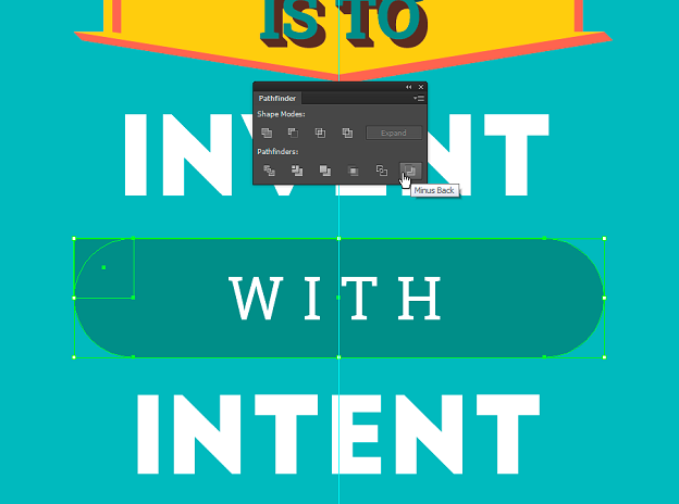
This shape will make corners for the ribbon. Hit Ctrl+F to reposition the basis of the ribbon that you copied earlier. Right-click on the corner and select Transform › Rotate. In the pop-up, set the value to 90 degrees and click "OK". Then create another 14×14 mm square using the Rectangle Tool (М).
Using the Rectangle Tool (М) again, create a square with the dimensions of 14х14 mm. Adjust the shape like on the screenshot below:
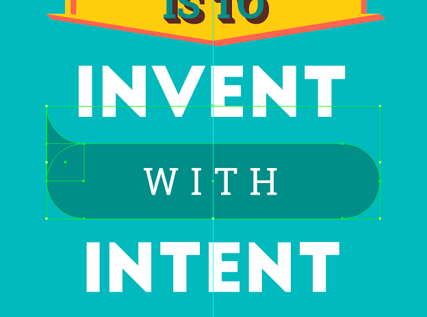
Select the square and the new triangle, go to the Pathfinder and choose Shape Modes: Unite. Duplicate the designed element and place it on the other end of the ribbon.
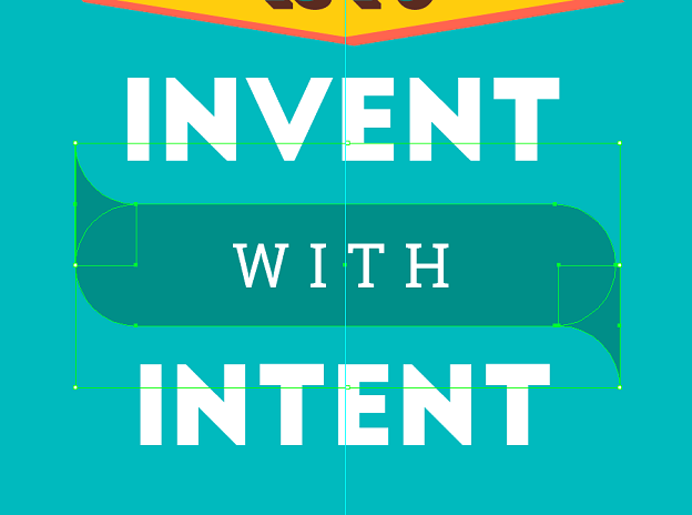
Select all elements of the ribbon, go to the Pathfinder and select Shape Modes: Unite.
Select the created element and press Shift+Ctrl+M. In the pop-up set the Position Horizontal – 0 mm, Position Vertical – 32 mm, and click Copy. Select this element once again and set Position Horizontal – 0 mm, and Position Vertical – 32 mm in the Move window. Then click Copy.
As a result, you get three identical elements with the same amount of space between them. Apply the following color to the top and bottom parts of the ribbon:
R:72
G:165
B:160
(#48a5a0)
Then select the top element. Right-click on it and select Transform › Reflect. Set 90 for Vertical.
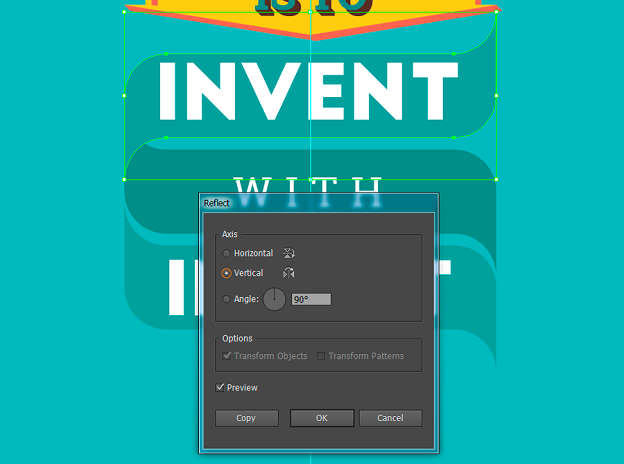
Select the bottom element and press Ctrl+D to repeat the previous action and turn the element. Using the Pen Tool (P), remove the right points from this part of the ribbon.
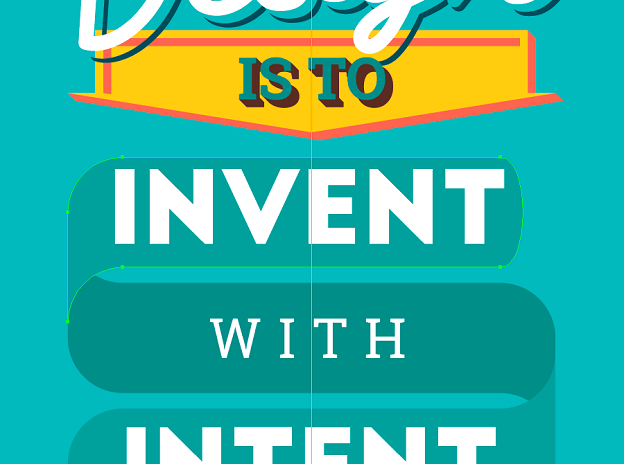
Take the Anchor Point Tool (Shift+C) and remove the guides from the corner points. With the Direct Selection Tool (A) make the length of this ribbon part the same as the other elements. Using the Pen Tool (P) put a point in the middle of the right side of the ribbon.
Select this point with the Direct Selection Tool (A) and call the Move window (Shift+Ctrl+M). Set Position Horizontal -8 mm, Position Vertical – 0 mm, and click OK.
Here's what the element looks like now:

Repeat the same actions for the other end of the ribbon, but instead of the value Position Horizontal – 8 mm set 8 mm in the Move window.
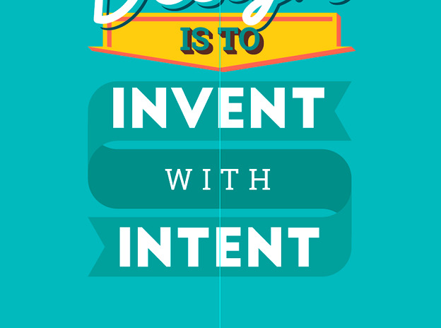
If you've done everything right, you should get a ribbon like this.
7. Playing with invent and intent
Let's get back to the text. Lock the elements layer and go to the text layer.
Choose the "INVENT" text and align it according to the ribbon. Then go to Object › Expand. In the pop-up window click OK.
Fill this layer with:
R:199
G:86
B:65
(#c75641)
Hit Shift+Ctrl+M and enter Position Horizontal – 2, Position Vertical – 2, and click Copy.
Fill the new layer with the following color:
R:168
G:41
B:45
(#a8292d)
Next, move it to the background with Shift+Ctrl+[.
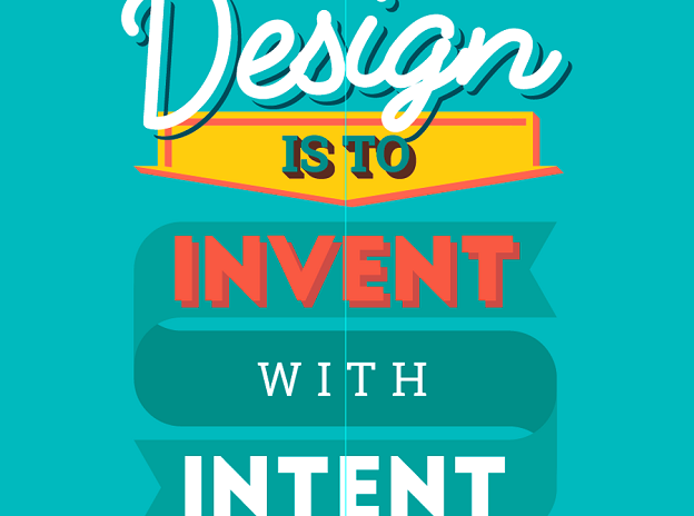
Just like with the "IS TO" shadow, use the Pen Tool (P) and Direct Selection Tool (A) to get a nice, realistic shadow.
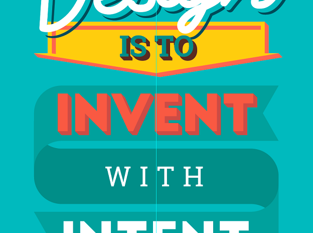
To make the text more bright and fun, let's add some dots. First, create a custom brush. Take the Ellipse Tool (L) and set Ellipse Width – 1.5 and Ellipse Height – 1.5.
Apply the following color to the circle:
R:248
G:235
B:220
(#f8ebdc)
In the Brushes tab (Window › Brushes or F5) click on the drop-down list icon and select New Brush.
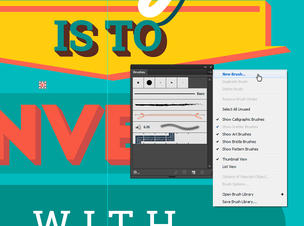
In the New Brush window select Pattern Brush and click OK.
In the next pop-up Pattern Brush Options name the brush "Dotter", then set the value Spacing – 60% and click OK.
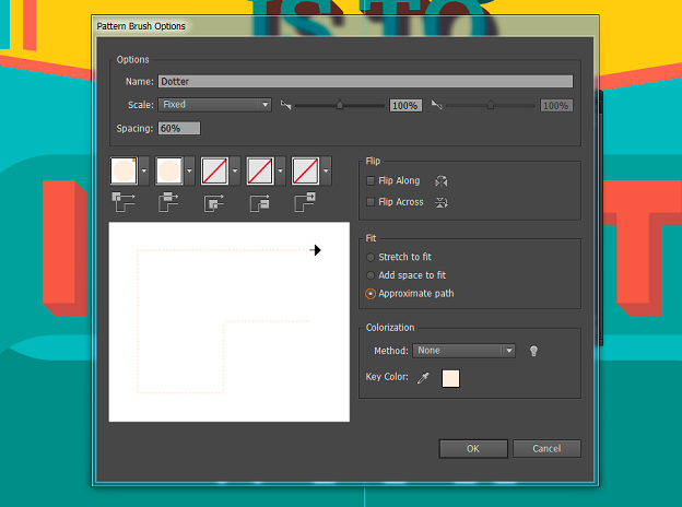
The brush is ready and you can delete the circle you created before. With the Pen Tool (P) draw a line in the middle of the letter "i". Make sure that the line doesn't have the main filling. Then click on your new brush in the Brushes panel and see what you get.
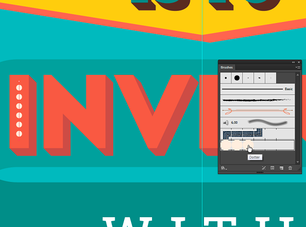
Then we add dots to other letters.
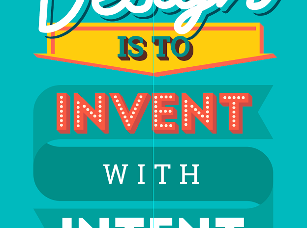
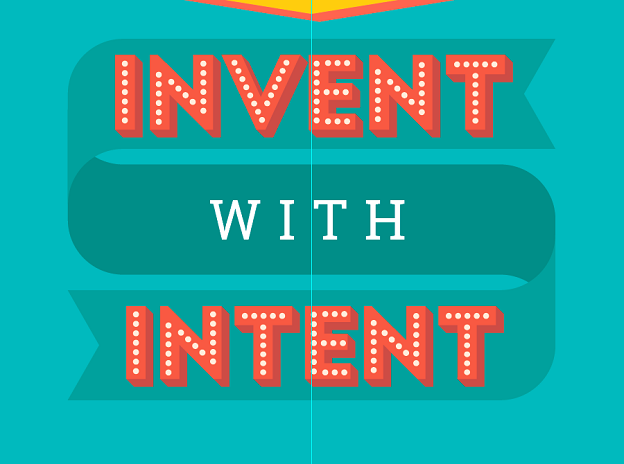
Apply the same effects to the word "INTENT":
8. Adding a simple text effect
Select the word "WITH" and go to Object › Expand. Click OK and apply the color: R:244 G:206 B:47 (#f4ce2f). Hit Shift+Ctrl+M and set Position Horizontal – 1, Position Vertical – 1, and click Copy.
Add the following color:
R:78
G:46
B:32
(#4e2e20)
Then send it to the background with Shift+Ctrl+[.
Now you need to fix the shadow. You already know how that works. You'll need the Pen Tool (P) and Direct Selection Tool (A). It's almost ready!
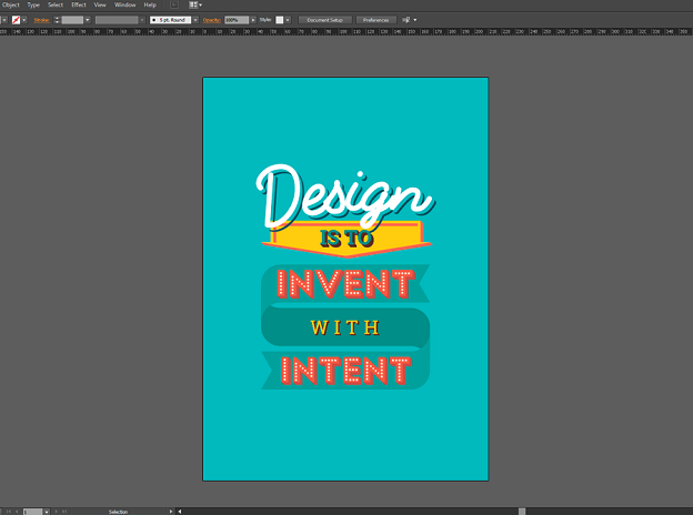
9. Adding textures
Go to the Layers tab and lock the current text layer. Create a new layer called "texture" and put it above the "bg" layer.
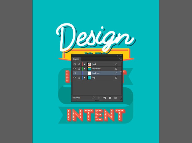
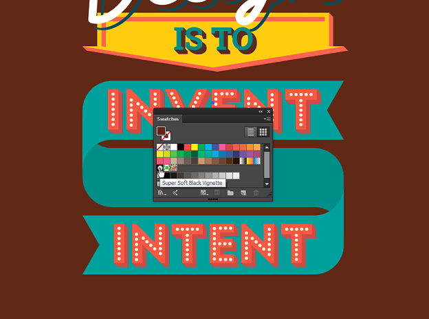
Take the Rectangle Tool (M) and draw a rectangular of the document size. In the Swatches tab (Window › Swatches) choose Super soft Black Vignette.
Now let's fix this gradient a little bit. In the Gradient panel (Window › Gradient or Ctrl+F9), create a gradient that goes from black in the center to white on the edges. Opacity should be 100% in both cases.
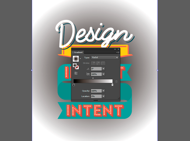
Use the Gradient Tool (G) and adjust the new gradient. Make it oval and slightly wider than the poster layout.
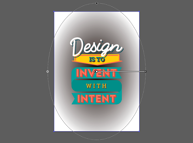
Go to Effect › Pixelate › Color Halftone. In the pop-up window, set Max Radius to 20 px. In the Screen Angles fields set any identical values.
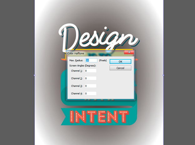
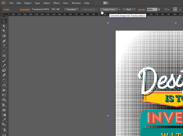
Click ОК. Go to Object › Expand Appearance. To turn this raster layer to vector, click Image Trace in the top panel.
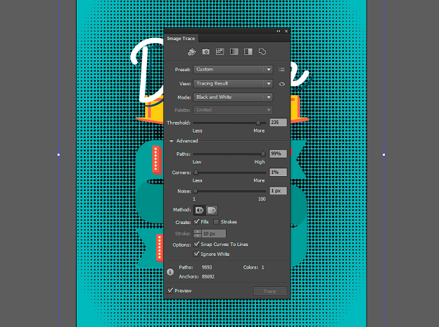
Then hit the Image Trace Panel icon and enter the following parameters: Model – Black and White. The Threshold should be close to maximum, 235 in our case. The Paths value should also be set to maximum. The Corners and Noise should be set to a minimum. Don't forget to put a check mark to Ignore White. Close the window and hit Expand.
Apply the following color:
R:126
G:186
B:187
(#80c2c3)
Your poster is ready!
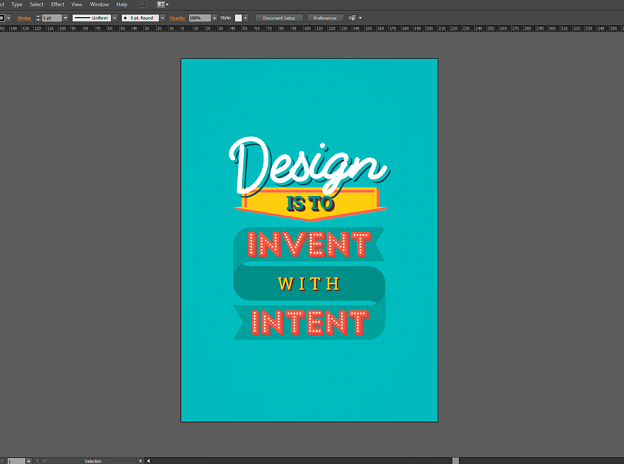
That's It!
I hope you enjoyed the tutorial, created a neat typographic poster design, and learned some cool and interesting stuff along the way! Do share your thoughts and don't hesitate to ask questions!
This article was written by Anna Lisnyak, the Art Director at PSD2HTML.com, the leading PSD to HTML and web development company. With over 8 years of graphic design experience, Anna is an avid reader and blogger. She has an exceptional eye for details and enjoys everything related to typography, web and UI/UX design.
How To Make Typography Posters
Source: https://99designs.com/blog/design-tutorials/create-typographic-poster-adobe-illustrator/
Posted by: ashleywiling.blogspot.com

0 Response to "How To Make Typography Posters"
Post a Comment